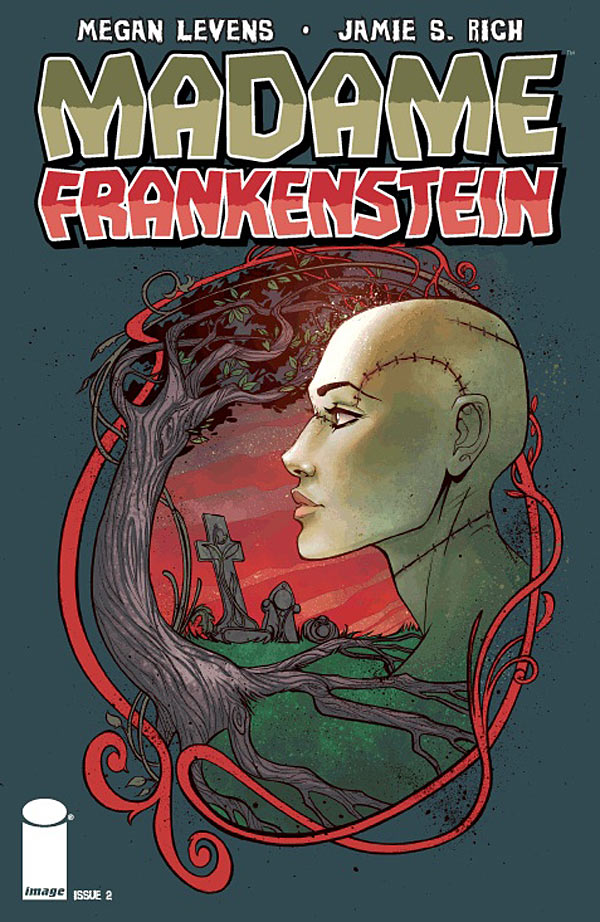
A few more Madame Frankenstein reviews. Some of the ones posted after the release seem a little more cautious, but that's okay. We're building something here, and I think as the story continues, as readers learn more about everything, folks will be happy. Either way, it helps me evaluate my approach to sequential storytelling, which is a positive.
That all said, I was pretty stoked by this one from Horror Talk. I think it's great that genre blogs have given the book some notice.
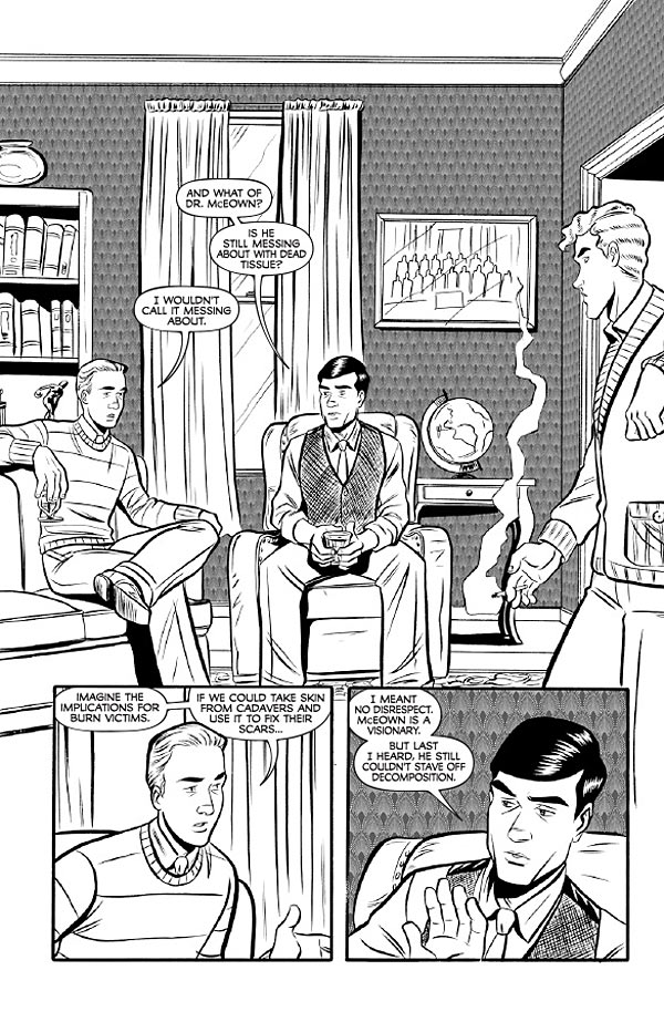
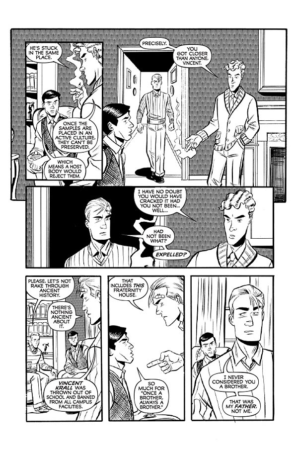
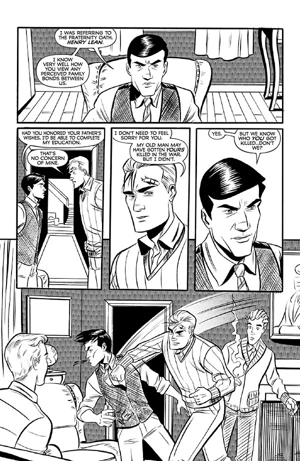
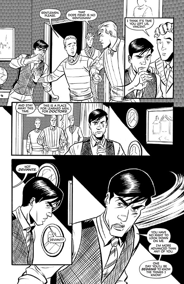
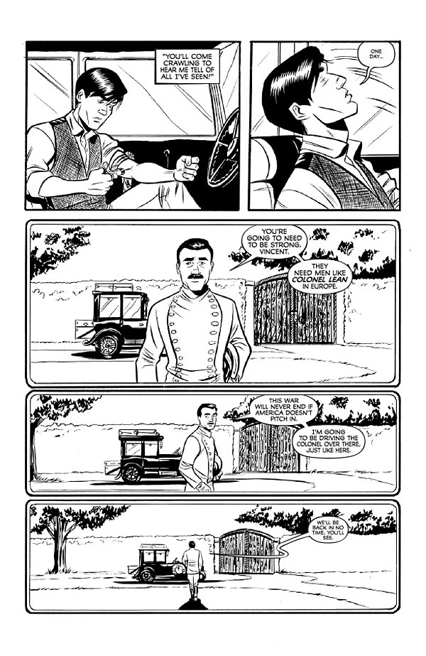
Madame Frankenstein is set in 1932 and Megan Levens artwork helps preserve that time period perfectly. The characters look like they were taken from the set of The Great Gatsby. She bounces between creepy mad science in Krall's lab to a beautiful gorgeous landscape. The aforementioned fairies are far from Disney-like. Instead they're emaciated with an almost alien look to them.
* Omnicomic has some thoughtful reactions, and seems pretty well versed in the inspirational material.
Rich's dialogue appropriately fits the atmosphere, as he places the proceedings in 1932 Boston. There's a good sense of the time in the book, with the characters speaking and appearing within the time referenced. There's also a grand sense of poetry in the script, with Rich tapping into some of the romantic ideals that made Mary Shelley's original work so popular. It fits in the scope of the book and gives the reader a bit more to think about as they're reading.
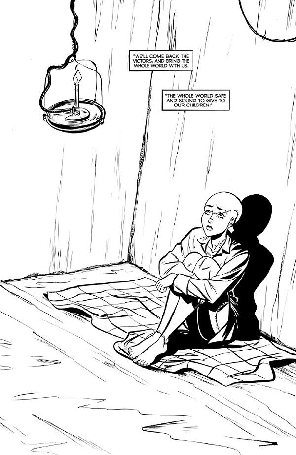
With the book's sense of romanticism comes an equally relevant illustrative style. Levens draws a look that is very clean and defined by bold, black lines. She infuses the work with the look of 1932, with characters illustrated with a sense of being dapper that makes the book feel elegant. Character anatomy is very illustrative and defined, ensuring that the reader isn't thrown off and can find themselves in the era. Even the revival of Madame Frankenstein doesn't give the reader a hulking beast to fear; rather, they're given a look at a woman who looks very similar in walking death as she did in life.
* IGN gives us a 7.7.
What’s really creepy though, is the scientist of the story, Vincent Krall, who is shown to be in love with the 'monster' and wishes to 'teach her how to be a lady.' The whole thing is quite unsettling in a way that may be intentional, but could possibly open up a controversial can of worms.
* Broken Frontier is pretty even-handed in its reservations.
If the central narrative of the first issue was a little sketchy, I think there’s clearly enough thematic depth to the story to warrant a return visit. The pre-publicity made much of the book’s ‘Frankenstein meets My Fair Lady‘ pitch, and those two narratives have always seemed to me like two sides of the same coin.
Even if we accept that a hubristic scientist could breathe life back into the dead, how would that ‘monster’* be socialised? Life might be restored as a series of biological processes, but how and to what extent could that being become a ‘person’ again?
* Adventures in Poor Taste amusingly calls ours into question.
There also seems to be a prominent supply of naked breasts to observe in this issue; which of course begs the question, did you make a female version of a story simply to show off T and A? Sure she’s naked and a corpse, but the amount of boob shots screams, “Please horny teen buy this book!”
You got us. We figured there were so few ways for teenage boys to get pictures of boobs these days... :)
* Capeless Crusader wasn't necessarily against the bare breasts, but made the mistake of reading the comic at work. Oops. Anyway...
It feels caught between too many worlds. On one end it seems like it wants to pay homage to the literary classic Mary Shelly penned and so it delves into the philosophical end. But then it also kind of wants to be reminiscent of the more “schlocky” horror films and so you’ve got a woman running around with her breasts out for a large chunk of the comic. And then on the third hand of this monster of a monster story, it kind of wants to do its own thing so there is no use of the word “Frankenstein” in a comic titled Madame Frankenstein, so I’m not sure where it wants to go. But I will say on an ending note that I did actually quite like the book and want to read the next one.
* Whereas Backwards Compatible approaches it with the skepticism of someone who likes Mary Shelley's novel a lot, and is not yet sure how to assess what he's reading. Fair enough!
Jamie S Rich does a great job of making you understand why the doctor is partaking in his endeavours but I do have one major issue with his storytelling and that is the use of fairies. I hope this will play out with as a useful plot device and not a way to explain the science but I will reserve judgement until finding out the answer. The visual story has been created by Megan Levens and it is really suited to the text. The black and white art feels like it comes from the early days of comics, the clean lines make for well structured faces especially on the doctor.
Don't worry, there is more going on with the fairies than you realize yet! It's been a common question, though.
* Another fan of Shelley gives us high marks over at Sight on Sound:
Levens’ art and Rich’s script complement each other nicely and together they make the first issue of Madame Frankenstein worthy of carrying on the legacy of Mary Shelley’s Frankenstein.
* Fellowship of the Geeks:
Is this a new take on an old classic? Or is it an entirely different story from another time, or another place? It’s completely wide open, but this is certainly a delightful start. You’ll want to get in on this at the beginning.
* Unleash the Fanboy gives us a 9.
* * *
And with that...I am a bit pooped. But thanks everyone who has been taking the time to share their thoughts. It's been enlightening to see how folks react to different elements, and to ponder some of the structural criticisms.
Onward to #2!
Current Soundtrack: Lily Allen, Sheezus


